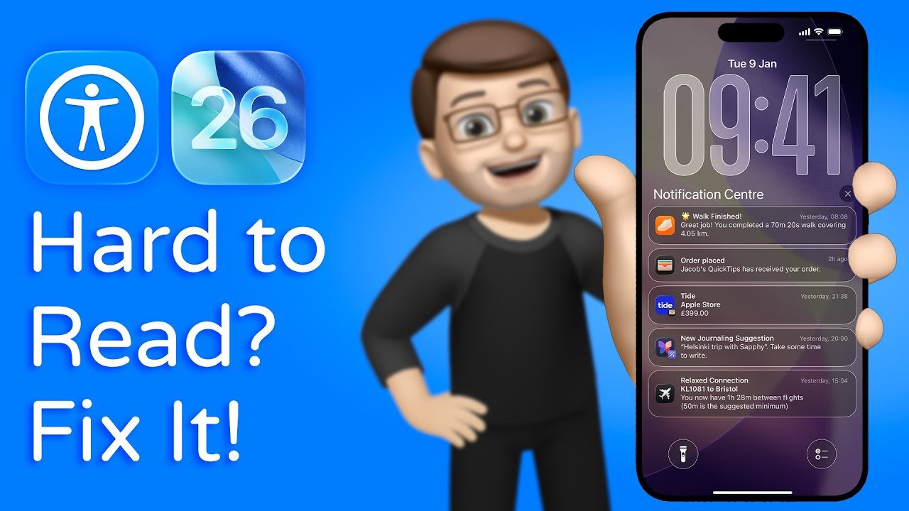
You update to iOS 26 and notice the screen looks slick but harder to use. Text feels softer, menus blend into the background, and your eyes work more than before. If the design slows you down or feels uncomfortable, you are not alone.
You cannot fully turn off Liquid Glass in iOS 26, but you can reduce its effects and make the system easier to read and use. Apple built Liquid Glass into the core design, yet several settings let you cut transparency, boost contrast, and bring back a more solid look.
This article shows how to dial back Liquid Glass without breaking your workflow. You will learn which settings matter, what changes actually help, and how to shape iOS 26 into something that feels closer to the older style while staying practical.
Key Takeaways
- Liquid Glass stays on, but you can limit its impact.
- Simple display and icon changes improve clarity fast.
- Accessibility tools make iOS 26 easier to use every day.
Why Liquid Glass in iOS 26 Is Controversial
Liquid Glass changes how your devices look and feel in daily use. The design aims to feel modern, but it also affects readability, battery life, and consistency across your Apple devices.
Design Changes From iOS 18 to iOS 26
You notice the biggest shift when you move from iOS 18 to iOS 26. Apple replaces flatter surfaces with layered transparency, blur, and shine. Menus, notifications, and widgets now sit on semi‑clear panels instead of solid blocks.
Key design changes you see right away:
- More transparent backgrounds behind text
- Blur effects that react to wallpapers
- Brighter highlights on buttons and controls
These choices look polished in demos. In real use, they can make text harder to read, especially on busy wallpapers. Reviews note that this style can increase eye strain and slow older devices, especially on iPhone models with less headroom, as reported in coverage of the iOS 26 Liquid Glass backlash.
User Experiences and Common Complaints
Your experience often depends on lighting, wallpaper, and device age. Many users say Liquid Glass hurts legibility in messages, notifications, and Control Center. Thin fonts over transparent layers cause problems at a glance.
Common complaints include:
- Reduced text contrast
- Extra battery drain from visual effects
- Inconsistent behavior across apps
Apple offers a fix through Accessibility. Turning on Reduce Transparency helps, but many users feel Apple should not hide a basic usability control. A detailed breakdown of these issues appears in analysis of why users say Liquid Glass hurts readability and focus. Security updates still matter, though, which is why experts urge you to update even if you dislike the look, as explained in guidance on why iOS 26 updates still protect your iPhone.
Liquid Glass on iPhone, iPad, and Mac
You see Liquid Glass across iPhone, iPadOS 26, and macOS Tahoe, but it does not behave the same everywhere. On iPad, larger screens soften the impact, though multitasking views can feel cluttered. On Mac, transparency layers stack quickly, which some users find distracting during work.
A quick comparison shows the trade‑offs:
| Device | Main Issue | Practical Impact |
|---|---|---|
| iPhone | Readability | Harder to scan alerts |
| iPad | Visual clutter | Busy Split View layouts |
| Mac | Layer overload | Slower visual focus |
Apple pairs Liquid Glass with real system upgrades, including security and performance fixes, as outlined in coverage of non‑cosmetic features added in iOS 26. The controversy comes from how much attention the design gets compared to those deeper improvements.
Core Limitations of Liquid Glass Customization
Liquid Glass in iOS 26 gives you some controls, but Apple locks the core look. You can reduce motion, raise contrast, and tweak opacity, yet the system keeps transparency and layered effects in place. Updates in iOS 26.1 and iOS 26.2 adjust edges, not the foundation.
Why Liquid Glass Can’t Be Fully Disabled
You cannot turn Liquid Glass off in iOS 26. Apple ties it to system frameworks, so apps and menus share the same visual rules. Accessibility tools help, but they do not restore the old solid look.
You can make limited changes:
- Reduce Transparency and Increase Contrast improve readability.
- Reduce Motion cuts animations.
- Home Screen styles change icon tone, not UI layers.
What stays locked:
| Feature | Status |
|---|---|
| Full opacity UI | Not available |
| Classic iOS 18 look | Not available |
| Per‑app Liquid Glass toggle | Not available |
Apple added an opacity control in iOS 26.1, which helps some screens feel less glassy, but it does not remove the effect systemwide, as explained in coverage of the iOS 26.1 Liquid Glass opacity setting. Practical tips can improve legibility, yet they work around the design rather than replace it, as shown in guides on improving Liquid Glass readability.
Official Statements and Updates From Apple
Apple presents Liquid Glass as a long-term design shift, not a temporary theme. Public messaging frames it as flexible and evolving, shaped by feedback, rather than optional. Reporting on Apple’s rollout notes steady refinements instead of reversals, including tweaks to spacing and contrast across updates like iOS 26.2, discussed in analysis of why Apple is iterating on Liquid Glass.
Apple has not announced a “classic mode” or a master switch. Third‑party summaries confirm that you can only approximate the older feel through settings, not restore it fully, as outlined in guides on changing Liquid Glass toward an old look. Expect incremental polish, not a full opt‑out.
How to Reduce Liquid Glass Transparency
You can soften or limit the Liquid Glass look by changing a few display settings. These options cut down see-through layers, sharpen edges, and make text easier to read across iPhone, iPad, and Mac.
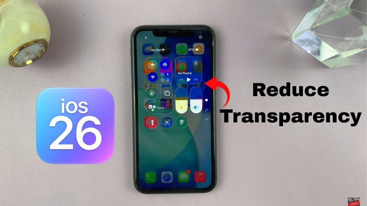
Reduce Transparency on iPhone and iPad
You control most of the effect from one setting. On iPhone and iPad running iPadOS 26, open Settings > Accessibility > Display & Text Size, then turn on Reduce Transparency.
This change replaces frosted panels with solid backgrounds in places like Control Center, app menus, and system pop-ups. Text stands out more, especially on light wallpapers.
For a flatter look, pair this with Increase Contrast in the same menu. Apple does not offer a full off switch, but this combo makes the biggest visible difference, as shown in guides on reducing Liquid Glass transparency in iOS 26.
Reduce Transparency on Mac and iPadOS
On a Mac running macOS Tahoe, open System Settings > Accessibility > Display. Turn on Reduce Transparency to limit blurred backgrounds in the Dock, menus, and sidebars.
The Mac setting works much like iPhone and iPad. It removes many layered effects and replaces them with flat colors.
If you use an iPad with a keyboard or trackpad, you will notice similar gains in readability. Apple uses the same accessibility logic across platforms, which helps if you switch between devices often, as explained in this guide on disabling Liquid Glass effects.
Effect of Reducing Transparency on UI
Reducing transparency changes how the interface feels and how clearly you see content. It does not affect your data or app layout.
You will notice:
- Clearer text on menus and pop-ups
- Stronger borders around buttons and panels
- Less background bleed-through from wallpapers
Animations and shapes stay the same. Only the see-through layers change. Apple designed this setting to improve legibility, not to fully revert to the old flat design, as noted in this walkthrough on changing the Liquid Glass look in iOS 26.
Reverting Display Changes
You can undo these changes at any time. Go back to Display & Text Size on iPhone or iPad, or System Settings > Accessibility > Display on Mac, and turn Reduce Transparency off.
If you tried multiple options, reset them one by one:
- Turn off Increase Contrast
- Turn off Reduce Motion, if enabled
- Check Display & Brightness for any Liquid Glass style options
Your system applies changes instantly. You do not need to restart. This makes it easy to test what works best for your eyes without locking yourself into one look.
Adjusting Liquid Glass With Tinted and Clear Modes
Apple added Tinted and Clear display modes to help you tone down Liquid Glass without turning it off. These options change how transparent layers behave across menus, apps, and system panels. You control them from system settings, and they affect both readability and visual comfort.
Selecting Tinted or Clear in Display Settings
You can switch between Tinted and Clear from Settings > Display & Brightness on iOS 26.1 and later. Apple introduced this toggle to give you more control over Liquid Glass without removing it entirely, as covered in this guide on changing Liquid Glass with the new Tinted option in iOS 26.1.
- Clear keeps the full glass look. Backgrounds stay see-through.
- Tinted adds a soft color layer. It reduces background bleed-through.
For extra control, pair this with Settings > Accessibility > Display & Text Size. Turning on Reduce Transparency further flattens menus and pop-ups. This combo works well if text feels hard to read or visually busy.
Pros and Cons of Each Mode
Each mode solves a different problem, so the right choice depends on how you use your phone.
Clear mode
- ✅ Keeps Apple’s intended design
- ✅ Looks cleaner in bright light
- ❌ Text can blend into busy backgrounds
- ❌ More visual motion in layered menus
Tinted mode
- ✅ Improves contrast and text clarity
- ✅ Reduces eye strain for some users
- ❌ Slightly dulls colors
- ❌ Less depth in apps and system panels
If Liquid Glass feels distracting, Tinted mode offers a practical way to change Liquid Glass without breaking the iOS look. For deeper changes, some users also combine this with other options that reduce Liquid Glass effects in iOS 26.
Making iOS 26 More Readable and Accessible
You can reduce visual strain in iOS 26 by adjusting contrast, text clarity, and how buttons and icons appear. These changes target the most common problems people report with Liquid Glass, including low contrast, blurry text, and hard‑to‑spot controls.
Increase Contrast Settings
The fastest improvement comes from contrast controls in Settings > Accessibility > Display & Text Size. Turn on Increase Contrast and Reduce Transparency to cut down the layered glass look that causes blur and low contrast.
These settings darken interface edges and reduce see‑through effects. Many users report better legibility right away, especially in Control Center and system menus. OS X Daily notes that these changes help counter the reduced readability introduced by Liquid Glass, even though they do not fully restore the older iOS look, as explained in this guide on improving iOS 26 legibility.
Use both options together. Each one helps a little, but the combined effect makes text and panels easier to separate from the background.
Further Enhancing Text Visibility
Text clarity depends on more than size alone. In Display & Text Size, enable Bold Text to thicken letter shapes. This matters because Liquid Glass reduces contrast between text and backgrounds.
You can also adjust text size, but be careful. Larger text can cause labels to overlap in some apps. Several reviewers point out that iOS 26 handles large text less gracefully than earlier versions, which can hurt readability instead of helping it, as discussed in this breakdown of a simple tweak that improves iOS 26 readability.
For widgets, keep text size moderate. Smaller widgets with dense text show problems faster, especially on the Home Screen.
Customizing Button and Icon Appearance
Liquid Glass softens button edges and icon shapes, which can make controls harder to spot. You can fix this by turning on Button Shapes and On/Off Labels in Settings > Accessibility > Display & Text Size.
These options add visual cues like underlines and clear toggle states. They help you see what is tappable without guessing. iGeeksBlog explains how these changes reduce confusion when using the new UI, especially when paired with icon and Home Screen tweaks, in their guide on toning down Liquid Glass in iOS 26.
You should also review widget styles and icon themes. Simpler styles with solid backgrounds improve contrast and reduce visual noise.
Customizing the Home Screen and Icons

You can adjust the Home Screen in iOS 26 to reduce glare and improve clarity. Apple lets you change colors, themes, and layout without turning Liquid Glass off. These options help you tone down Liquid Glass while keeping your phone usable and familiar.
Home Screen Appearance Options
You control most visual changes from the Home Screen editor. Press and hold an empty area, then tap Edit > Customize. iOS 26 gives you direct tools to change Liquid Glass without digging through menus.
Key options you can adjust:
- Themes: Default, Clear, Dark, or Tinted
- Icon mode: Light, Dark, or Auto
- Brightness slider: Lowers background shine
- Icon size: Improves spacing and readability
If the transparency feels too strong, pair these changes with Reduce Transparency in Settings > Accessibility > Display & Text Size. Apple confirms this setting darkens layers and improves contrast, which many users prefer when Liquid Glass feels distracting. Techlusive details these steps clearly in its guide on changing the Liquid Glass look in iOS 26.
Customizing Widgets and Icon Color
Widgets reflect the same visual rules as your Home Screen. When Liquid Glass feels busy, widgets often make it worse. iOS 26 lets you fix that.
You can:
- Switch widgets to tinted or dark styles
- Resize widgets to reduce background blur
- Match widget color to your wallpaper
Icon color matters more than it sounds. Tinted icons lower contrast shifts caused by translucent layers. Tom’s Guide notes that Liquid Glass icons respond well to darker or neutral colors, which reduce visual noise on the Home Screen. Their walkthrough on customizing iOS 26 Liquid Glass icons shows how color choices affect readability.
If widgets still feel overwhelming, remove nonessential ones. Fewer layers mean fewer reflections.
Using Dark and Clear Themes
Dark and Clear themes work best if you dislike the reflective look. Dark reduces glare. Clear keeps transparency but softens it.
You can combine themes with system settings:
- Turn on Dark Mode in Settings > Display & Brightness
- Use Clear theme with lowered brightness
- Enable Increase Contrast for sharper edges
Geeky Gadgets explains how Clear and Dark themes change the way Liquid Glass reflects light on the Home Screen. Their guide on customizing the iOS 26 Home Screen with Liquid Glass shows side-by-side examples that highlight these differences.
Dark Mode works best at night or indoors. Clear works better if you want depth without harsh shine.
Comparing iOS 26 With Previous and Parallel Systems

You see the biggest changes in how iOS 26 looks, how often people install it, and how Apple applies the same design across devices. These shifts affect daily use, update timing, and how much control you keep over visual settings.
iOS 18 vs iOS 26: Key Differences
iOS 18 focused on stability and gradual changes. iOS 26 pushes the Liquid Glass design, which many users dislike. Adoption data shows the impact. As of January 2026, only 18.1% of iPhones run iOS 26, while iOS 18 reached 77.1% at the same point in its cycle, according to iOS 26 adoption data from Macworld.
You can still reduce some effects. In System Settings, you can lower transparency under Display & Brightness > Liquid Glass. That helps, but it does not fully restore the iOS 18 look.
Practical differences that matter to you:
| Area | iOS 18 | iOS 26 |
|---|---|---|
| Visual style | Flat, simple | Glass-like layers |
| Update adoption | Very high | Very low |
| Custom control | Limited | Slightly improved |
Security still matters. Even critics note you should install updates like iOS 26.2 to stay protected, as explained in Tom’s Guide’s warning about skipping iOS 26 updates.
Cross-Platform Changes With iPadOS 26 and macOS Tahoe
Apple did not limit Liquid Glass to the iPhone. iPadOS 26 and macOS Tahoe use the same visual language. This creates a consistent look, but it also spreads the same problems across screens.
On iPadOS 26, transparency affects multitasking views and app switching. If you rely on Split View or Stage Manager, the layered glass effects can reduce contrast. You can adjust some settings, but Apple keeps tight limits.
macOS Tahoe applies Liquid Glass to menus, windows, and system panels. The effect looks modern, but it adds visual noise for some users. Like iOS, System Settings offers small tweaks, not a full opt-out.
If you use multiple Apple devices, this matters. The design now follows you everywhere, whether you want it or not.
Advanced Tweaks and Accessibility Tips
You can reduce the strain caused by Liquid Glass by adjusting deeper system settings, refining Control Center, and tuning device-specific options. These steps focus on clarity, motion control, and daily usability rather than looks.
Further System and App-Level Adjustments
Start in system settings where small changes add up. Liquid Glass relies on transparency and motion, so reducing both improves readability and comfort. Apple does not offer a true classic mode, but you can soften the effects through accessibility tools, as explained in guides on changing Liquid Glass on iOS 26.
Focus on these settings first:
- Reduce Transparency and Increase Contrast to sharpen text
- Bold Text, Button Shapes, and On/Off Labels to make controls clearer
- Reduce Motion to limit sliding and zoom effects
App-level settings matter too. Many Apple apps let you turn off background blur or animations. Third-party apps often include their own contrast or theme options, which can counter Liquid Glass effects inside the app even when the system look stays the same.
Using Control Center and Third-Party Apps
Control Center gives you fast access to features that help when Liquid Glass feels distracting. You can customize it to surface tools you use often, such as Reduce Motion or Focus modes. Pocket-lint notes that these quick toggles make it easier to manage the new design without digging through menus in tips to make Liquid Glass better.
Consider adding or relying on:
| Tool | Why it helps |
|---|---|
| Focus modes | Limits visual clutter from notifications |
| Low Power Mode | Reduces background animation load |
| Zoom (Accessibility) | Helps when text looks compressed |
Some third-party apps offer custom launchers, simplified widgets, or high-contrast themes. These do not change Liquid Glass itself, but they reduce how often you interact with its most distracting elements.
Device-Specific Considerations (AirPods Pro 3, More)
Certain devices amplify how Liquid Glass feels. With AirPods Pro 3, features like head tracking and animated volume changes add motion you may not want. You can disable head tracking and limit adaptive audio behaviors to keep interactions predictable. Apple’s design system applies across platforms, as outlined in Liquid Glass explained and customized.
On iPad, larger screens make transparency more obvious. You may need stronger contrast settings than on iPhone. If you use larger text sizes, expect occasional overlap, which remains a known issue reported in legibility tips for iOS 26.
Adjust per device, not once for everything. Liquid Glass reacts differently depending on screen size, accessories, and how you interact day to day.
Final Thoughts
If you’re not loving Liquid Glass in iOS 26, you’re reacting to real tradeoffs. You learned that the new look pushes transparency and motion hard, which can hurt readability and comfort for some people, especially on older phones. Reports of eye strain and slower performance show up across user forums and reviews, including coverage of the iOS 26 Liquid Glass backlash.
You also saw that Apple left you practical escape hatches. Accessibility options can reduce transparency and boost contrast without breaking apps. That matters when you want your phone to feel like a tool again, not a visual demo. Security updates still matter, though, so skipping updates isn’t a safe choice; guidance like Tom’s Guide explains why you should keep updating even if you dislike the design, as noted in advice about updating to iOS 26 despite Liquid Glass.
A few takeaways to keep you productive:
- Tweak settings first: Reduce Transparency and Increase Contrast.
- Watch performance: Older devices may feel the hit more, a concern echoed in reports of performance and design complaints after iOS 26.
- Decide by use: If you read and work a lot, clarity beats shine.
Liquid Glass in iOS 26 isn’t neutral. You now know where it helps, where it hurts, and how to bend it back toward your needs.